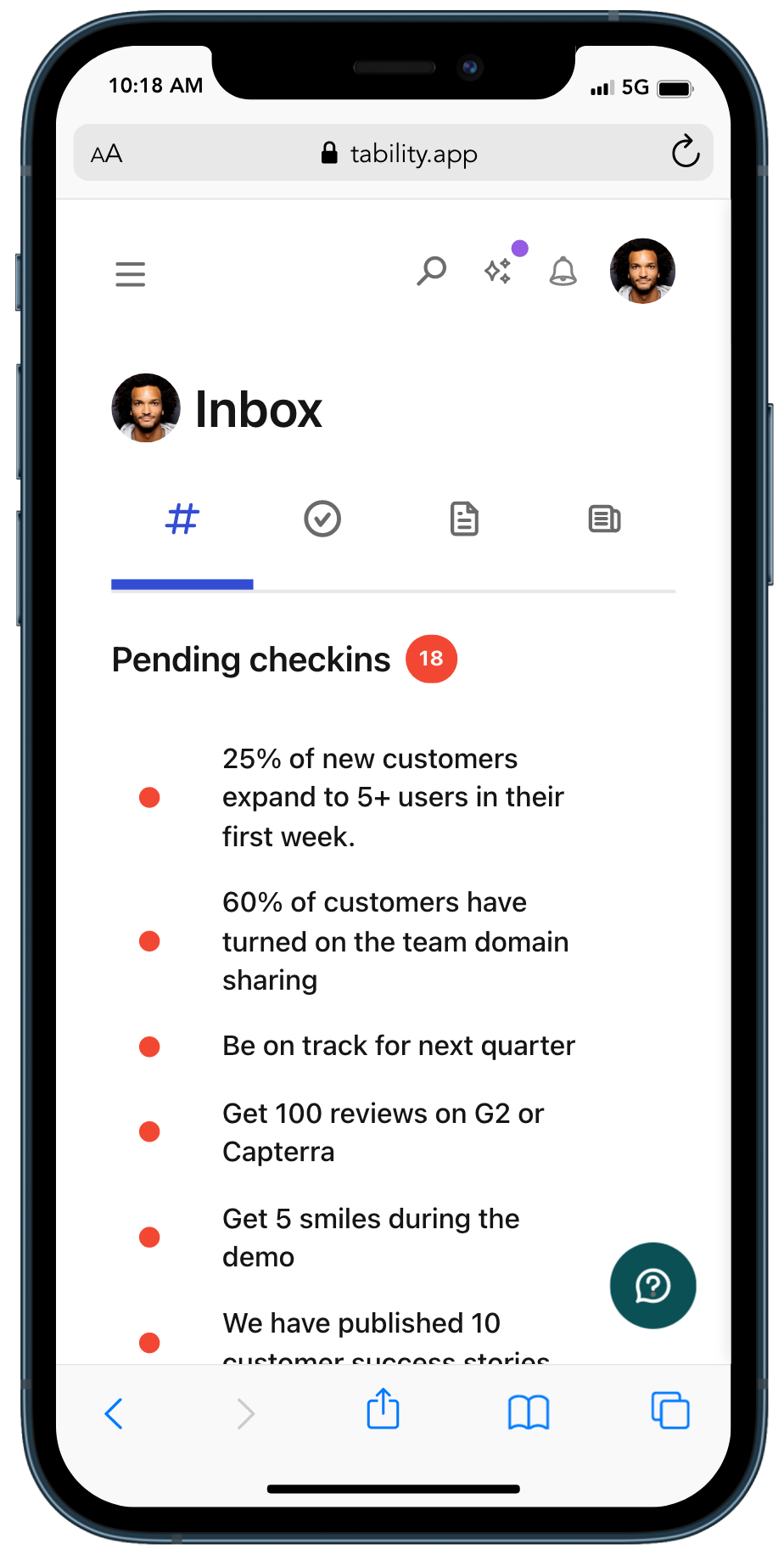
For a long time Tability suffered from poor UX on small screens. Well, don't get too excited yet, but we've made some good progress to make the platform much easier to use on a phone.
We just released first set of improvements, which was to make it easy to navigate your inbox and do check-ins. FINALLY! 🎉
The plan views (outcomes, tasks, reports) are not yet optimized, but you can expect us to address those soon.
Thanks for your patience 🙏